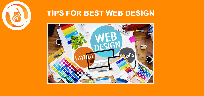
The trend has moved from plain HTML to CSS due to several upgrades in animation and graphics. Nowadays, developing a website with creative skills is significant to make the client stay along. CSS is a spicy way to control the website layout and its appearance. As an integral part of modern website development companies in India, approximately 96.9% of websites use CSS as of Jan 2023.
CSS is an emerging trend to help developers adopt the changes and techniques to produce responsive web designs.
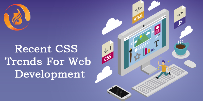
CSS stands for Cascading Style Sheets. It is a stylesheet language used to define the presentation of a document written in HTML or XML, including the layout, colors, fonts, and other visual elements of a webpage. CSS provides a way to separate the presentation of a document from its content, allowing web designers to create more flexible and sophisticated layouts and designs without having to modify the HTML code directly. CSS works by defining rules that apply to specific HTML elements or groups of elements, and these rules can be applied to an entire website by using external style sheets or embedded in individual web pages using the <style> element. CSS is an essential tool for web development companies in India and is widely used in building websites, web applications, and mobile apps.
Here is the top list of CSS that adapt to the trends in 2023:
Grid Layout and Subgrid
Subgrid is a specification of Grid Layout Module Level 2, which allows a grid item with its grid to align with its parent grid in one or both dimensions. It includes grid-template-columns and grid-template-rows. In a grid container, only the direct children become grid items while adding display: grid to a grid container. In a nested grid item, it is not possible to track sizing from the parent grid while it is independent of the parent grid. Instead of creating a new track listing, you can set the value subgrid on grid-template-columns, grid-template-rows, or both, and the nested grid uses the tracks defined on the parent.
The nested grid will have three column tracks the same size as the parent grid while you are using grid-template-columns: subgrid.
CSS Scroll Snap
The feature for controlling planning and scrolling behavior with snap positions in a CSS module is referred to as CSS Scroll Snap. To enable scroll snapping, the scroll-snap-type property must be defined to control the scrolling behavior in the scroll container. To enable scrolling, overflow must be enabled to define the size of the container. To create a snapping offset in the scroll container, the scroll-padding option must be enabled. There also include the properties like scroll-snap-align, scroll-snap-stop, and scroll-margin.
CSS Logical Properties (Inline and Block)
The CSS Logical Properties include inline and block keywords, which refer to things in an abstract way. We can use inline to refer to left and right, while to refer to top and bottom, we can use block. The common properties are block-size, inline-size, max-block-size, max-inline-size, min-block-size, and min-inline-size.
Container Queries
Container Queries can be implemented in all the major browsers, which makes a big impact on how we think about responsive design. You can set a breakpoint based on the size of the parent container as @container (max-width: 650px){ … }.
Inert attribute
The inert attribute is a global attribute to indicate the element that is not interactive, which is the same as the disabled attribute. It proceeds the way to define the inactive portions of the user interface.
The :has pseudo-class
The: has pseudo-class lets you select elements that contain other elements with respect to a reference element. It is a way of selecting a parent element or a previous sibling element by taking a relative selector list as an argument.
The accent-color option
The accent color is a shade used in small quantities of space on a website, such as checkboxes and radio buttons, to add impact and interest.
The accent-color property specifies the accent color for user-interface controls like: <input type=”checkbox”>, <input type=”radio”>, <input type=”range”>, and <progress>.
Three new color palettes
HWB, LCH, and LAB are three color spaces that can be used in CSS to define colors.
HWB: HWB stands for hue, whiteness, and blackness. It is a cylindrical color model that defines colors based on the hue angle, the amount of white in the color, and the amount of black in the color. In CSS, you can use the hwb() function to define a color in the HWB color space. For example: color: hwb (120, 50%, 25%);
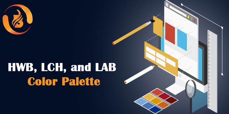
LCH: LCH stands for lightness, chroma, and hue. It is a cylindrical color model that defines colors based on the lightness of the color, the chroma (or saturation) of the color, and the hue angle. In CSS, you can use the lch() function to define a color in the LCH color space. For example: color: lch(50%, 75, 120);
LAB: LAB stands for lightness, a, and b. It is a color space that defines colors based on the lightness of the color and the two color opponent dimensions, a and b. In CSS, you can use the lab() function to define a color in the LAB color space. For example: color: lab(50%, 20, -10);
These color spaces provide more flexibility in defining colors and can be useful in creating unique color palettes and achieving specific color effects. However, it is important to note that not all browsers support these color spaces, and it’s essential for web development companies in India to check browser compatibility before using them.
Visit us at: www.biovustechnologies.com